
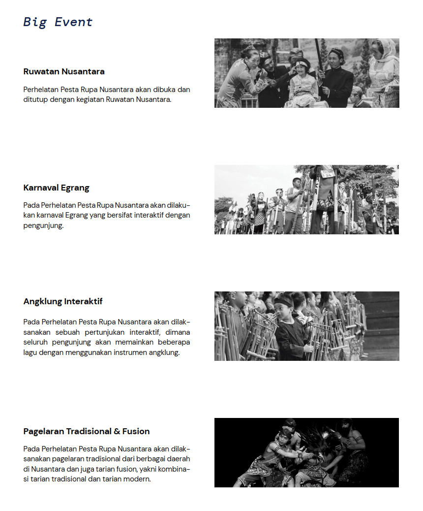
Pesta Rupa Nusantara
Pesta Rupa Nusantara — a landmark outdoor installation art festival hosted at Taman Mini Indonesia Indah (TMII) — needed a complete brand identity system that could carry the weight of its cultural ambition. The event is envisioned as the largest outdoor installation art festival in the Nusantara archipelago, running annually from 2023 to 2028, with each edition exploring a different indigenous material culture — beginning with bamboo.

ROLE
PROJECT DATE
2023 to 2028 - Postponed
THE BRIEF
Giving Indonesia's Visual Art a Voice
The client required a visual identity that could function across monumental outdoor environments, printed collateral, digital platforms, and merchandise — while authentically representing Indonesian contemporary art and its deep roots in traditional knowledge.
"We needed a brand that felt like a celebration of being Indonesian — not a museum piece, but a living, breathing, contemporary identity."

PROBLEM
Three tensions at the heart of the project
Indonesian visual art has a profound cultural heritage and an internationally respected contemporary scene — yet no single event had successfully bridged these two worlds at scale. The brief surfaced three interrelated design problems that had to be resolved simultaneously.
The Heritage Trap
Existing Indonesian cultural event identities defaulted to literal folk motifs — creating a nostalgic, museum-like aesthetic that felt inaccessible to contemporary audiences and irrelevant on the international stage.
The Scalability Problem
The identity had to work across five annual editions, each with a distinct material theme (bamboo → rattan/metal → metal → metal/stone → stone), requiring a flexible system that could evolve without losing coherence.
The Authority Gap
The event needed to command enough cultural authority to attract serious artists like Joko Avianto, Tisna Sanjaya, and Eko Prawoto — while remaining approachable enough to draw thousands of daily public visitors at TMII.
DESIGN INTENT
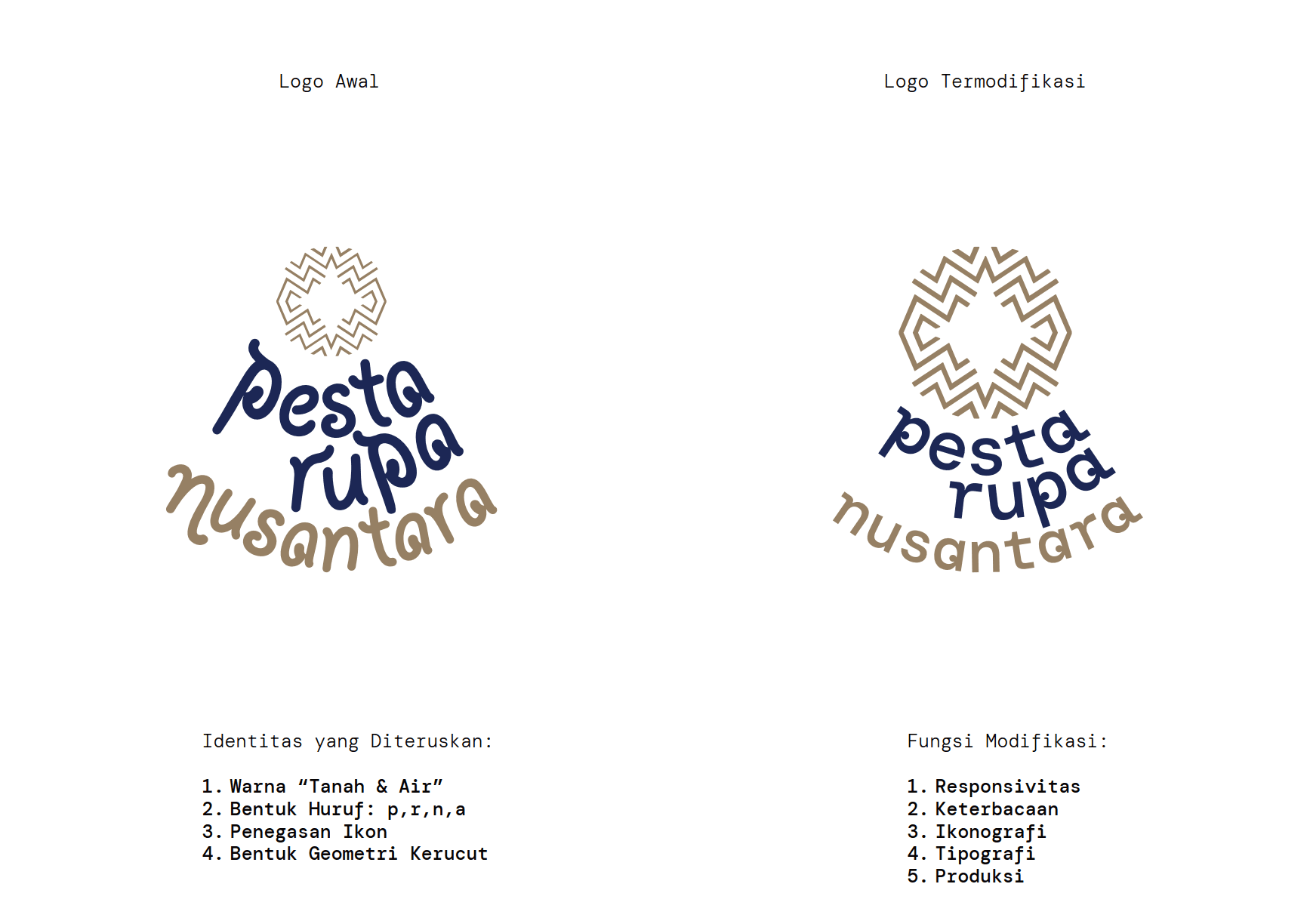
A mark that is woven, not printed
The central intent was to create a brand identity system that functions simultaneously as contemporary visual language and as a direct expression of Nusantara material culture. Every design decision was made in service of a single guiding idea: the brand should feel like it was made by hand, by many hands, across many islands.
The primary symbol — a radial geometric motif constructed from interlocking chevron forms — draws directly from traditional woven textile patterns found across Java, Sumatra, and Kalimantan. It is simultaneously a rosette (a universal symbol of celebration and gathering), a stylised bamboo joint seen from above, and a mandala-like structure suggesting wholeness.
INSIGHT
The answer lives in material culture
Deep research into the festival's foundational concept — material culture as a bridge between contemporary art and traditional knowledge — revealed a strategic direction: the symbol had to feel woven, not drawn. Indigenous textile and weaving patterns across the Nusantara archipelago share a geometric logic: repetition, rotation, interlocking forms that create a whole greater than any single element.
Symmetry as Cultural Logic
Nusantara craft traditions — ikat weaving, batik, songket — are built on symmetrical, repeating geometric systems. The symbol needed to feel structurally familiar to Indonesian eyes.
Modularity Mirrors the Material
Bamboo, the inaugural material, is structural and modular — each culm identical, yet assembled into infinite forms. The brand system adopted this same philosophy.
Unity in Diversity
The festival's tagline — "Merawat Kebangsaan Merayakan Seni" — called for a mark that embodied plurality and harmony: many fragments, one coherent whole.
Local Roots, Global Legibility
Competitors like Art Basel and Frieze use stark, typographic identities. The insight: Pesta Rupa could achieve international authority through cultural specificity — not despite it.
OUTCOME
An identity system built to last
The final identity system — primary wordmark, alternate logotype suite, symbol, colour system, typography framework, and environmental application guidelines — was delivered as a comprehensive brand book and digital toolkit. The identity was adopted and positioned the festival as a credible contender in the international contemporary art calendar.
The alternate logotype system — a stacked, condensed variant alongside the horizontal mark — gave the identity the flexibility needed for environmental signage across TMII's 150-hectare site, from 12-metre bamboo installation banners to wristbands and programme booklets. The indigo-and-gold palette photographed exceptionally well against both the lush TMII grounds and the monumental bamboo installations themselves.


