


Digi Bandoeng Festive
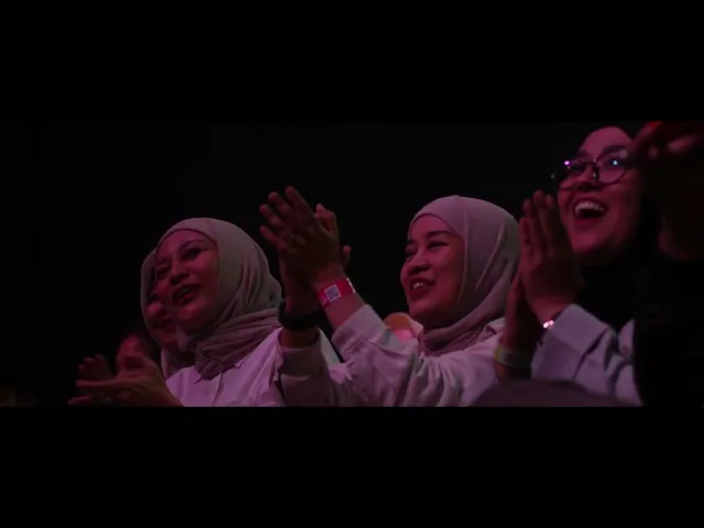
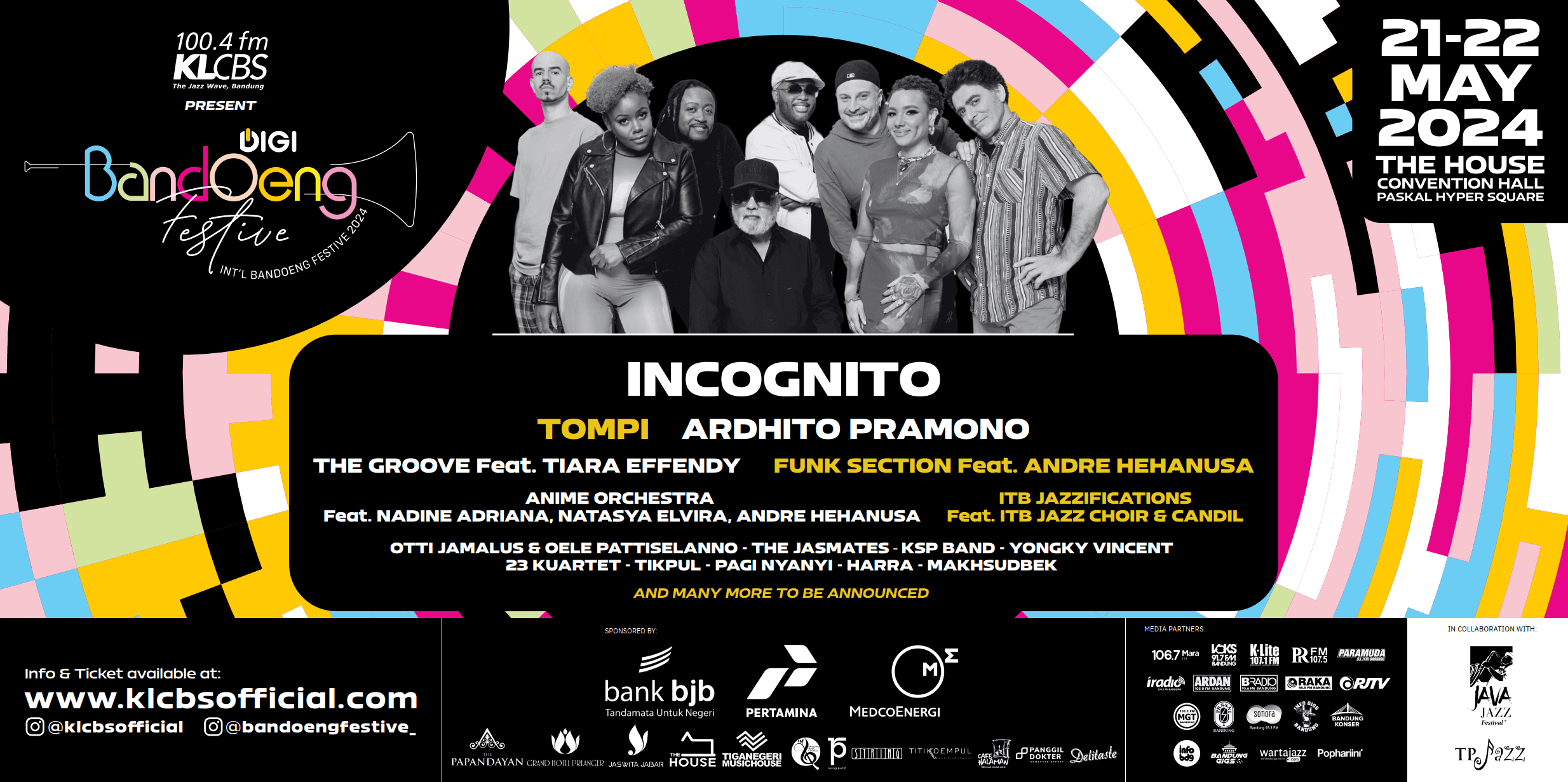
DIGI Bandoeng Festive 2024 is Bandung's premier international jazz festival, held on 21–22 May 2024 at The House Convention Hall, Paskal Hyper Square. The festival brought together over 3,000 jazz enthusiasts across two days, featuring four dedicated stages and a lineup that ranged from international act Incognito to beloved Indonesian musicians including Tompi, Ardhito Pramono, The Groove feat. Tiara Effendy, and Funk Section feat. Andre Hehanusa. Presented by 100.4 FM KLCBS and sponsored by Bank BJB, Pertamina, and Medco Energi, the event required a cohesive, high-energy visual identity that could carry across large-format print, digital social media, and on-ground collaterals.
ROLE
PROJECT DATE
21-22 May 2024
THE BRIEF
DIGI Bandoeng Festive 2024 — the Bandoeng International Jazz Festival — commissioned a complete visual identity system for its 2024 edition. The festival, presented by 100.4 FM KLCBS and held across two days at The House Convention Hall, Paskal Hyper Square, Bandung, required a single designer to lead all visual output: from the hero billboard to every digital touchpoint. The identity needed to establish the festival's character, communicate a rich and complex programme across four simultaneous stages, and work in service of multiple commercial sponsors — all while feeling distinctly Bandung.
PROBLEM
Bandung's jazz scene is vibrant but visually underserved. Previous festival communications had leaned on generic music-event tropes — dark backgrounds, stock photography, standard promoter layouts. The challenge was to break that pattern and create something that felt genuinely festival-grade: a visual system with its own personality, not just a container for line-up information.
Scale complexity: One identity had to work across a 200×300cm outdoor baliho, 1:1 Instagram posts, multi-column schedule grids, and co-branded pre-event collateral — each with completely different viewing distances and contexts.
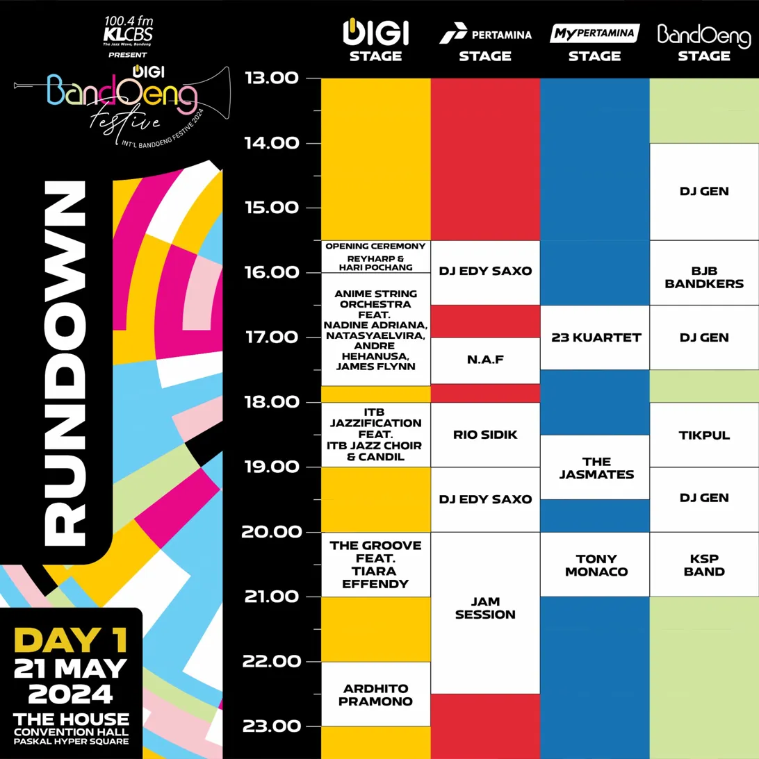
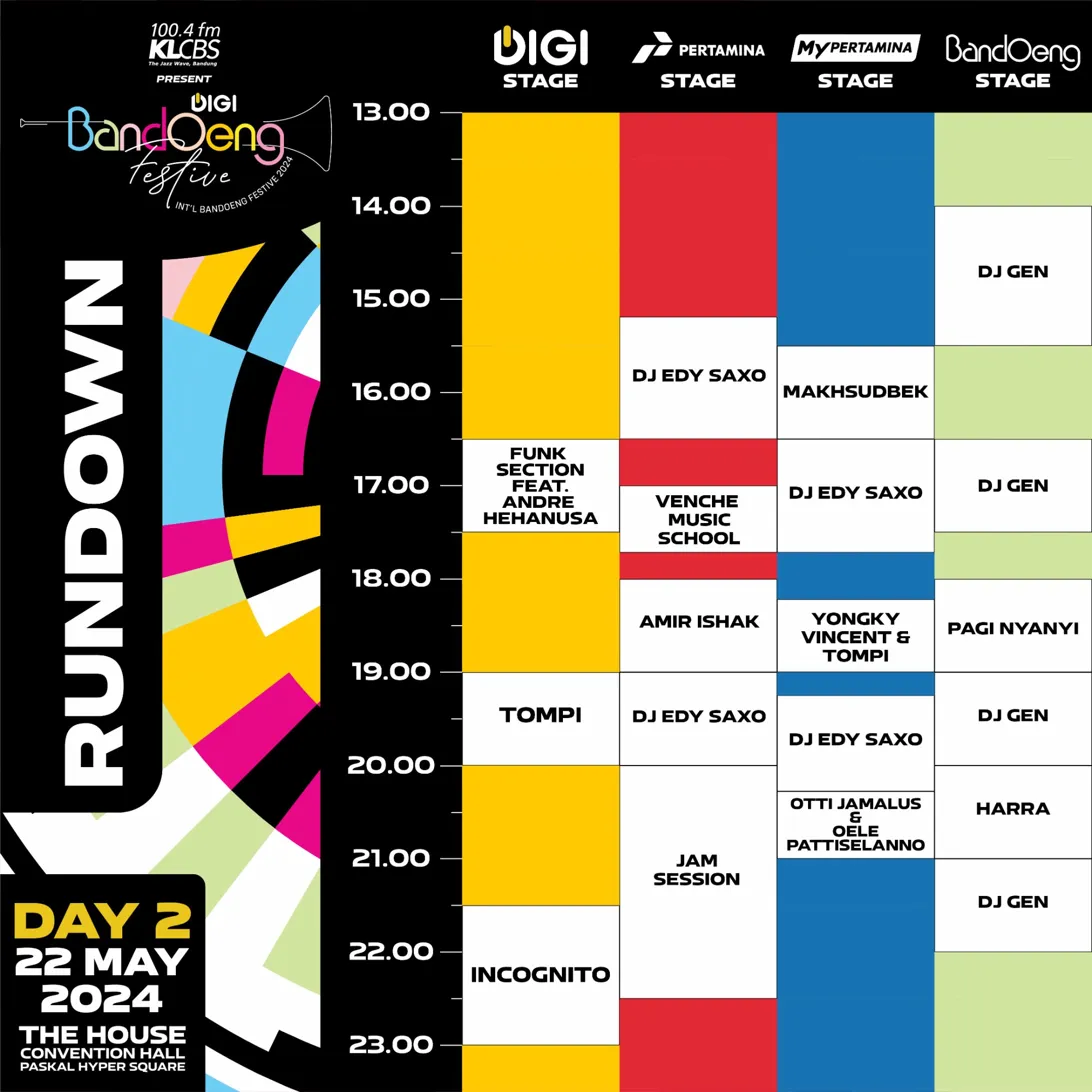
Programme density: 20+ acts across 4 simultaneous stages over 2 days needed to be communicated clearly without the schedule graphics becoming visually overwhelming.
Sponsor hierarchy: Three major sponsors plus multiple media partners and collaborators had to be accommodated without fragmenting the visual identity.
Speed: Festival communications require fast iteration — performer announcements, last-minute changes, and pre-event activations all demanded a system that could produce new assets quickly without breaking consistency.
DESIGN INTENT
The goal was to create a visual language rooted in rhythm and structure — the same principles that define jazz itself. Rather than illustrating jazz literally (instruments, silhouettes, sheet music), the identity would behave like jazz: a strong underlying grid with bold, expressive improvisation on top of it.
Own the space
The mosaic pattern system — geometric blocks in a strict four-color palette — was designed to immediately signal 'this is Bandoeng Festive' at any size, in any context, without needing a logo present.
Function as wayfinding
Color was not decorative. Each of the four festival stages was assigned a dedicated brand color. Every rundown graphic, sign, and stage banner would use these colors consistently, turning the visual system into a navigation tool.
Flex without breaking
The modular grid meant any asset — a baliho, a story, a rundown — could be built from the same blocks. New formats could be produced rapidly by assembling the system, not reinventing it each time.
Elevate the genre
Jazz deserved design that matched its sophistication. Bold type, deliberate restraint in layout, and a premium black ground were chosen to signal quality rather than noise — distinguishing the festival from typical event promotions.
INSIGHT
Three core insights shaped every design decision across the project:
Pattern is personality. In an environment saturated with event posters, a repeatable, ownable pattern does more identity work than any logo treatment. The mosaic border became the festival's fingerprint — audiences would recognise a DIGI Bandoeng Festive asset before reading a single word of copy.
The schedule IS the design problem. Most festival identities look great on a hero poster and fall apart on a rundown. By treating the schedule graphic as a core identity deliverable — not an afterthought — and building the color-stage system from the start, the rundown became one of the most distinctive and useful assets of the whole campaign.
Constraint enables speed. A strict system — four colors, one typeface weight, one pattern language — meant that every new asset required creative decisions about content, not about style. This drastically reduced production time and ensured nothing felt off-brand, even under deadline pressure.
OUTCOME
DIGI Bandoeng Festive 2024 sold out its ~3,000-capacity venue across both days and generated strong organic reach on social media in the lead-up to the event. The visual identity was consistent and recognisable across every audience touchpoint — from outdoor roadside bilboards to screens and on-ground signage inside the venue.
The color-coded stage system proved particularly effective in-venue: attendees and staff alike used the stage colors to navigate the festival floor, validating the decision to build wayfinding directly into the visual identity rather than treating it as a separate design problem.


